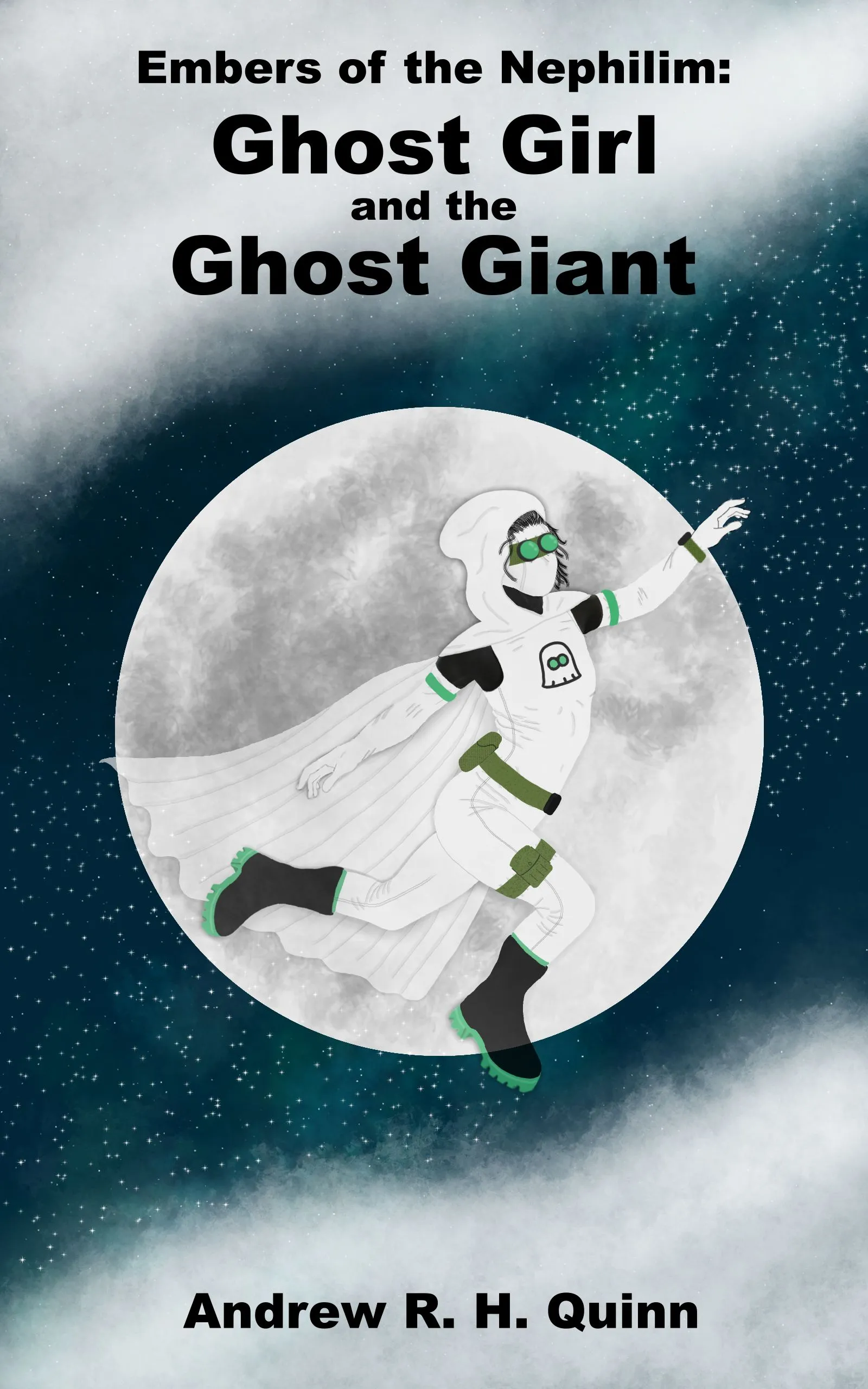
Annotations: The Cover
The cover went through a lot of variations, some better than others. And in the end, for better or worse, I decided to make the cover myself.
Haunted House Variant
Scrapped Before Even a Sketch.
Conceptually, the first idea that I considered was a haunted house. But while a rundown home would have been thematically appropriate with regard to the supernatural elements and impoverished neighborhood aesthetics, I felt that such a cover might turn away scaredy cats like myself. Furthermore, I felt that the title alone would attract horror fans (at the time, it was just Ghost Girl and the Ghost Giant). So, I opted to use the cover art to draw in a different crowd: fellow superhero fanatics1.
Floating Version

Initially, I wanted to depict the character floating in the air, but such an effect was hard to convey without motion. Nonetheless, it went through several iterations, and I eventually ended up keeping the cloud and moon placement as they served as a good background for the text and a main focal point, respectively.
Back-to-Back Rendition

Another version involved showcasing the titular Ghost Girl and Ghost Giant2 back-to-back to contrast their heights, builds, and color schemes. I liked this idea on paper, especially if I would be able to make them both partially transparent so that they were both see-through.
To avoid the issue of having to draw realistic people and fabrics, I intended to obscure them in fog and mystical shadow effects and let their glowing eyes and night vision goggles illuminate the scene.
This got as far as me writing a small program to generate the particles, but I stopped when the prototype didn’t turn out well. Upon further reflection, I concluded that while having two creepy indistinct silhouettes shrouded in mist might have been wonderfully eerie, having a blurry cover probably wouldn’t have been the best tradeoff. As a last-ditch attempt to salvage the idea, I tried an abstract fractal version before moving on.
Moonshot

As I continued writing, I eventually ended up with a scene where the protagonist jumped in front of the moon3. I thought that that would make for an awe-inspiring cover due to imagery and the sense of dynamism and motion conveyed by the silhouette. (I leave it as an exercise to the reader to determine if I was able to capture such a sensation in the final product).
I also liked how the “moonshot” idea dovetailed well with the color palette and the odds of this book’s likelihood of success, but I digress. I went back and forth on hiring a professional artist to do the cover but decided against it after:
- Struggling to find people to reach out to (and later not hearing back from those I contacted—no worries if any of you end up reading this)4.
- Wanting to avoid lock-in if I came up with a better idea down the road (I didn’t).
- Technically I draw it myself as I’d designed the costume to have no skin showing. So photorealistic faces wouldn’t be an issue…
Long story short, number three was what sold me on trying to do it myself5. I embarked down that road with the intention of passing off whatever I’d come up with as a mockup to a pro if I ever felt I couldn’t do a satisfactory job.
Like the floating version, I started with a cartoony render and maintained the clouds for future text placment, but I hated how the craters I kept trying to draw looked. Until that point, I was partially considering a somewhat less-than-real aesthetic (given my and the protagonist’s amateur drawing talents), but I didn’t want the cover art to potentially allow the book to be confused for a graphic novel, so I decided to try and lean into realism as best as I could/was practical.
Background Elements
Clouds

I felt confident about making a realistic version of this aspect of the image, given that I had released an app back in high school with an animated nebula6. (Trust me, it looks better in motion.) That said, I still needed some help figuring out how to use image editing software7 to replicate the effect. Unfortunately, they were all overly complicated and extremely beginner-unfriendly. Thankfully, I stumbled across this tutorial on what brushes to use.
Night Sky
Adding faint, distant stars to a dark background was easy enough, but I didn’t like how the navy blue went against the green and white color scheme, so I added a green nebula to rotate the hue and emphasize the future upward momentum of the image (though I didn’t match it entirely as I believed that would look a tad odd, so I gave it more verticality to break up the background a bit better).
The Moon
Though I’d never drawn something like that before, I felt confident that it would be easy, given my ability to make: a perfect circle (with the aid of digital drawing tools), add craters with digital spraypaint brushes, and apply a faint texture over the surface to make it look grittier and less flat. This may be the one part of the project in which I did not underestimate the difficulty, as it went off without a hitch.
For the realistic crater placement, I used a reference image from NASA (but I didn’t want to use it in the image directly due to theoretical copyright issues and the potential for it to literally and metaphorically outshine my work when placed in such close proximity).
The Character…

Illustrated by Gary Frank
Initially, I started trying to sketch the pose. However, it was obvious that there were issues with my outline. So, I went in search of reference photos. I wanted to depict the character in motion, sort of reaching upward toward something8, and I was reminded of DC’s Rebirth cover. I used Wonder Woman and Supergirl as references and even found a picture of Lara Croft jumping at a similar angle (sadly, I can no longer find this image).
The issue with using Lara, Kara, and Diana as references was that they were all far taller (i.e., had longer limbs), toned, and more well-endowed than my protagonist. Given her age, I wanted to avoid sexualizing her, so I did my best to age her down throughout the process.
In pursuit of that, I scoured stock photography sites for models of a similar stature. From there, I found a photoshoot taken from a consistent distance and angle and Frankensteined together a more realistically proportioned silhouette.
Note the distinct lack of an image here. This is my way of protecting you, dear reader, from having a horrific mockup of a happy gymnast with poorly photoshopped limbs seared into your memory9. Just know that I bore that burden on your behalf in pursuit of a better cover. And because of my sacrifice, only I (and whatever family members were unlucky enough to walk by at the time) am plagued by a twisted abomination with cropped forearms and calves rotated to different angles to preserve the proper proportions.
Needless to say, I painted over that hideous creation as soon as I could, and while I felt that I ended up with a better torso, the character’s back leg, and side continued to look bad no matter what I did. Nonetheless, this cover persisted for many months while the title continued to change until the deadline drew near.
To AI or not to AI? That is the question.

Throughout that time, I experimented with various models to see if they would be able to generate better people. In the end, they were able to fix issues with the limbs, but they were terrible at their hands and preserving the pose over the course of many iterations (not to mention that they could not get all the different types of clothing right at the same time)
In the end, I gave up on the AI-route or even using it to generate separate elements that I would then photoshop together before asking it to adjust the lighting and shading as the night vision goggles broke me. Look at these! No matter how many times I told it that I didn’t want swim, ski, or pilot goggles, it was determined to just keep drawing these things.

Wrinkles and Time
Nonetheless, I was able to use the better-proportioned AI imagery as a base to trace over and try to replicate the folds, but not all of them! (The gloves were way too wrinkly.) Even though I’m not 100% satisfied with the finished fabric, it is what it is. As the old saying goes, “real artists ship.”
I did think that the seams were a step up though, so I adopted the Ai’s idea—a touch I’ve always been fond of on other superhero suit designs10. Unfortunately, over the course of the eighteen-and-a-half hour day that I threw the cover and ebook together, it did not occur to me that I missed the shoulder seams and couldn’t figure out a way to improve the inner seam of the back leg. (Let that be a lesson to never work that much overtime.)
In some ways, I feel that the emblem area of the final version of the character took a step back, but it’s admittedly a fine line others have yet to complain about at this point, so I’ll call it a win and preemptively draw attention to it to deflect criticism.
Overall, I like the smaller shape of the hood11 and cape, but I am not a fan of the wrinkles in either. Regardless, I’d like to thank Robert Marzullo for putting together this tutorial on how to draw a cape. And while I couldn’t follow all of his advice (due to my limited skillset and the difference in art style), it at least made the lower edge of the cape look far better than a flat, flimsy 2D piece of paper.
Boots and Transparency
I am a big fan of the boot soles, but I forgot to add some form of laces to the front to help break up the shape. That said, I’m not sure how much I could have done to improve on making the laces look realistic, and I think that tweaking the transparency to showcase the protagonist’s abilities and namesake helped draw attention away from their rather flat look.
If I could go back, I’d want to texture the socks a tad, and while I’m happy with the shape I traced from the AI, they still look a tad big to me, and I feel her back foot might be slightly twisted. (Sorry, Liv!)
Going back to the topic of transparency, I wanted the cover to showcase a partially transparent person, but I couldn’t get the effect that I was looking for quite right. (i.e., solidity radiating out from her outstretched hand). But I think the opacity on the front fading into the back turned out alright. Thankfully, this also draws the eye away from the cape and the bad glove. (Wrong hand ;)
Hands

Thanks, Wikipedia!
Speaking of hands, as mentioned (and evidenced) previously, the AI is bad at them. So, I opted to draw those myself. Namely, by tracing a better example (because drawing hands is really hard). Naturally, I went with Michelangelo’s Creation of Adam because paying homage to that painting had been my idea from the get-go (as I liked the idea of the character reaching out to a higher power12). Also, I struggled to draw a decent second hand, so I just mirrored the first in the interest of time.
Initially, I had wanted to put an additional twist on the pose in the form of auroras, but alas, neither [this] man nor machine [AI] could render a convincing aurora in the time I had left. They kept ending up as bad-looking clouds. (Next time.) But essentially, my idea had been to have different strands of auroras “reaching” out in a vague hand shape, but that would admittedly have shifted the image’s perception from awe-inspiring to creepy eldritch horror.
Thus, at the eleventh hour, I leaned into the intended emotion and tried to play up the sense of wonder by having the character reach out to twinkling snow just starting to fall from the clouds.
For story reasons, she was also supposed to be trailing sparkly frost like a comet tail, but that was hard to convey in the space remaining. So I just built it up behind her and radiated it off her cape, trailing it along with the presumed wind direction so that it continued the general visual shape13. I think I was able to make her seem like the link between the glistening frost and snow on either side. Note: if you zoom in really far, you’ll see a definite break in “precipitation” around the moon.
Lighting and Shading of Lackthereof
Realistically, the moon should have been a lot brighter, but this was a delicate balance between realism and clarity and my limited artistic ability (not to mention the race against time to wrap things up). So, the moon is not as bright as it should be, thus alleviating the need to squint at the cover—which I think would be a turn-off for most (unless they were looking for ways to successfully stun a burglar).
Text
I’ll talk about suit specifics in a different blog post (i.e., at a more relevant place in the narrative), so for now, I’ll end with a brief bit on the font. It’s Arial Black. I’m a fan of simplicity. My two gripes with the text are that it looks somewhat plain, and the last part of “Giant” seems to blend into the background a bit too much. Perhaps both of these issues could have been resolved with a subtle glow or shadowing, but for the most part, I’m proud of what I was able to do given the time and tool limitations14.
Regardless of nitpicks and circumstances, I’m eternally grateful for the resources everyone put online for free and what they helped me accomplish!
Footnotes
-
This was also partly a marketing decision as my understanding is that horror-related works have historically not sold as well as other genres—thus making this story idea an even better idea for a debut novel, lol. ↩
-
Fun fact: the ghost giant’s silhouette was based on Hafþór Júlíus Björnsson (professional strongman of Game of Thrones fame) as he was the first individual that I could think of that best approximated the Ghost Giant’s stature and physique. ↩
-
Initially, the character jumped between two buildings, away from one on fire, as the snow started coming down. This scene was later altered and expanded upon, but I’m still fond of that initial premise. ↩
-
I was also somewhat apprehensive about the potential back and forth of trying to communicate and refine said idea with another party. But that was a rather minor concern in the grand scheme of things. Though I would have loved to include another person in the project to help promote it on the basis of showcasing their work! ↩
-
This seemed in line with the spirit of the project, where some decisions were made on the basis of being technically possible but not necessarily likely (e.g., the protagonist’s hair color (note: that’s a wig on the cover), and some super tall characters—such a certain 6’4” high school student in particular). ↩
-
Massive thanks to Raffaele Cecco for posting a tutorial on his blog for how to go about this—which sadly seems to have disappeared, hence the lack of a link. ↩
-
I switched back and forth between Paint.NET and GIMP before eventually settling on Krita, but I’m not partial to any of them. ↩
-
Like the edge of a stage in Smash Bros—sadly, I did not explore that avenue. *sigh* ↩
-
Plus, despite the fact that such an image would be a “transformative work,” its omission avoids any and all potential copyright issues. ↩
-
Maybe I would have come up with it on my own, but under the pressure to meet the deadline, I doubt it. ↩
-
Given the color and subject matter covered in the book, I wanted to avoid making the hood appear pointy, and I used Young Justice’s Miss Martian as a reference for the general shape—as well as Season One’s Robin for the covered shoulder idea. ↩
-
For the life of me, I cannot remember if I was consciously influenced by the Rebirth art or not, but this cover is now a loving homage to both. ↩
-
I even got to expand on this idea more in the wrap-around covers on the physical editions—which were stitched together—with varying degrees of success—by mirroring the background of the front (and using various layering, opacity tweaks to make them look like continuous, unique clouds). Perhaps the effect is diminished once one notices the mirroring trick, but I’m glad that the nebula asset got a bit more of a chance to shine without the moon obscuring it. ↩
-
One of my biggest gripes with Krita is the lack of mouse/stylus coordinates and the inability to center the text for precision (maybe the latter isn’t actually an issue, and I just don’t know how to do it, but my former point still stands). Krita needs realtime coordinates and I do not accept the argument that it was “too difficult to make performant” as such a feature was one of the very first things that I implemented in my own graphics editor prototypes over the years. It’s standard, informative, and really needs to be there—even if there’s just a subtle delay to not update them in realtime until the mouse or stylus comes to a standstill; that’d be a massive improvement! ↩